Partner Portal
Revamp of BCG's Legacy System
Project Type
About
User Experience, Visual Design
Problem statement: The legacy system for the portal used by managing directors and senior partners at Boston Consulting Group (BCG) had usability and accessibility issues, making it difficult to navigate and use.
Process: The goal was to provide a redesign for the portal used by managing directors and senior partners. The first step involved analyzing the existing design's information architecture and gaining insights into the page structure and the links within the portal. Building upon this analysis, I created a new information architecture that took into account the various types of links present in the portal. To gain a deeper understanding of user behavior, conducted an analysis of content views and interaction data from the past year. This analysis helped identify the levels of user engagement with specific pages and links. With a clearer understanding of the portal's structure and user interaction patterns, I moved on to creating low-fidelity prototypes. These prototypes served as visual representations, allowing me to envision the overall structure of the portal and establish a design framework. The design framework played a crucial role in defining how different types of links should appear on the portal, taking into consideration their relative importance. It provided consistent language and visual guidelines for the design of the portal. Building upon the design framework, I developed high-fidelity wireframes that captured detailed design elements and interactions. These wireframes, along with the design framework, served as the foundation for creating a working prototype of the final design. By following this iterative process, the legacy system was successfully transformed into a modern and user-friendly portal, addressing usability and accessibility issues. The final deliverables included hi-fi wireframes and a functional prototype, showcasing efforts put into redesigning the portal for an improved user experience.
Solution: The solution involved a modern redesign of the portal, addressing the usability and accessibility issues. The process included analyzing the existing system, creating a new information architecture, developing a design framework, and ultimately producing high-fidelity wireframes and a working prototype for the final design demo.
Disclaimer: Due to the sensitivity of this project, the presented deliverables have been sanitized and replaced with dummy information to exclude all private details privy to Boston Consulting Group.
Information Architecture
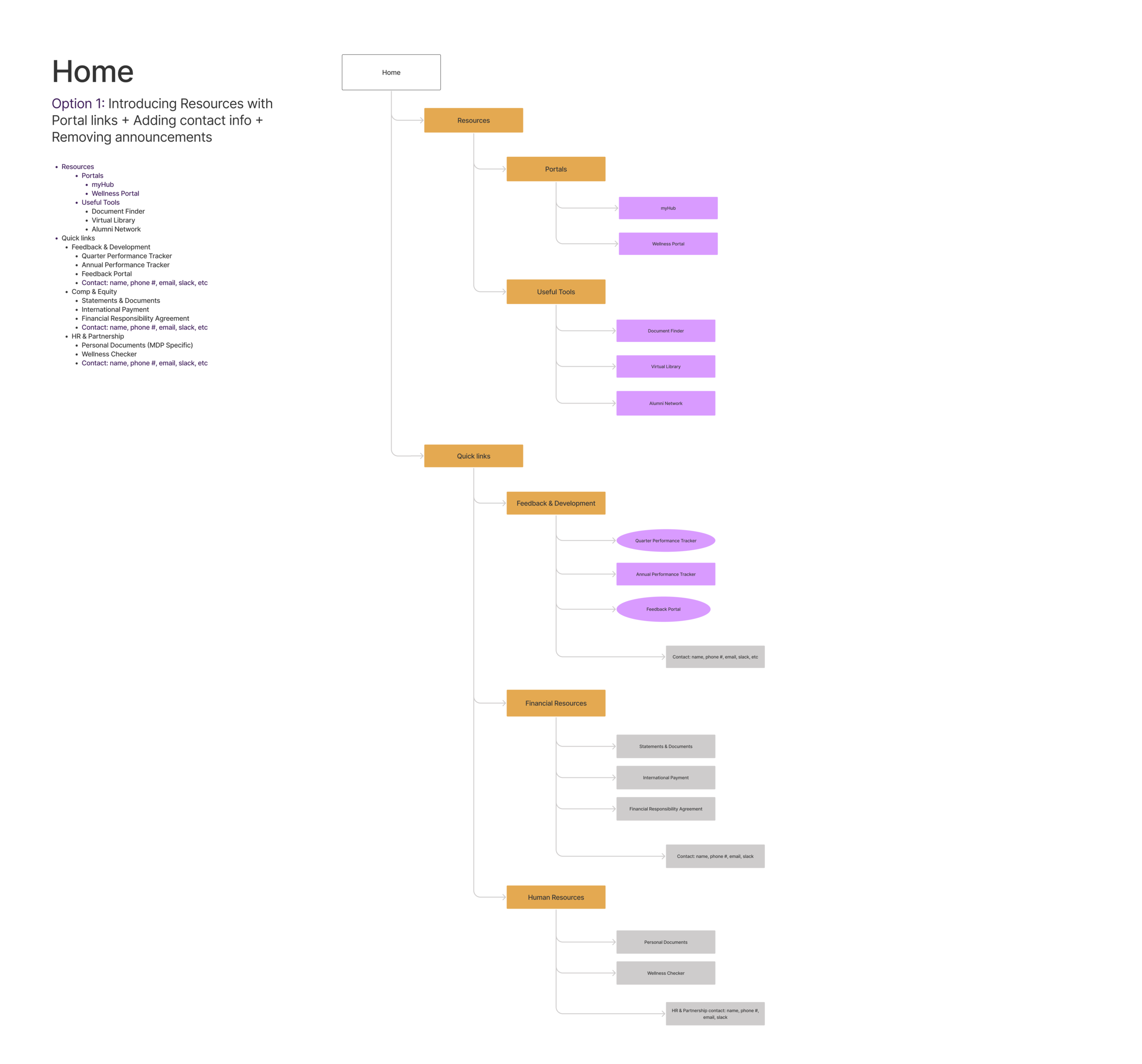
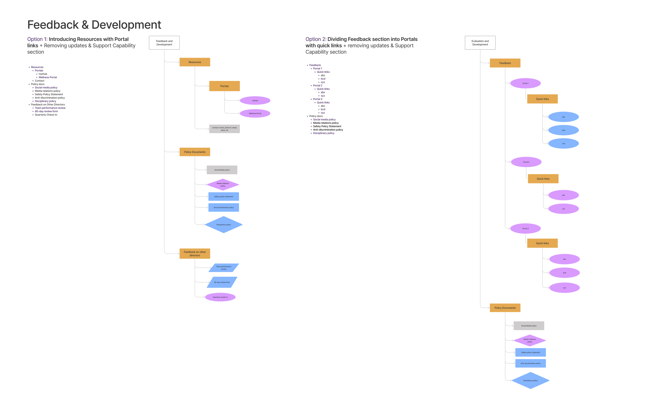
I spent some time mapping out the information architecture for the existing structure of the portal to keep a record of all the links existing inside the portal. I wanted to make sure I kept a record of all the different types of links so I came up with a system to categorize the links into “internal” versus “external” to the portal. The internal links included documents, videos, and internal pages. The external links included portals, tools, and other company websites. Based on this system I created the information architecture for the home page and parent page of the portal by creating sections for each page and regrouping links to fit these sections.
The information architecture for the pages are shown below


Views by Content- Analytics Report
The limitation was that this data explained the number of clicks per page but didn’t answer the “why” behind the clicks. Since I didn’t have data recording the specific retention rates/ bounce rates per click- it was difficult to attribute the number of clicks directly to the actual usage of the links.
Nonetheless, the data was helpful to figure out the relationships between data points to help make an assumption about the differences in levels of interaction among the links.
While working on the information architecture of the portal pages, I realized that before I worked on the layout of the page, I needed more information on the usage of the links. I wanted to know which links are used more often than others to know how to go about prioritizing them on the portal. To achieve this, I analyzed raw data capturing the number of clicks for all pages existing on the portal. I categorized the links into the pages they belong to and sorted the data in descending order. Based on the number of links per page, I was able to find the “top links” on each page (with relation to other links) and figure out which links were clicked on consistently across different quarters and how often they appeared.
Green: Most clicked, Yellow: Moderately clicked, Red: Almost never clicked
Site layout
While ideating about site layout, I used color blocks for different sections to play around with how different placements of the content may appear on the portal.
Lo-Fi Wireframes
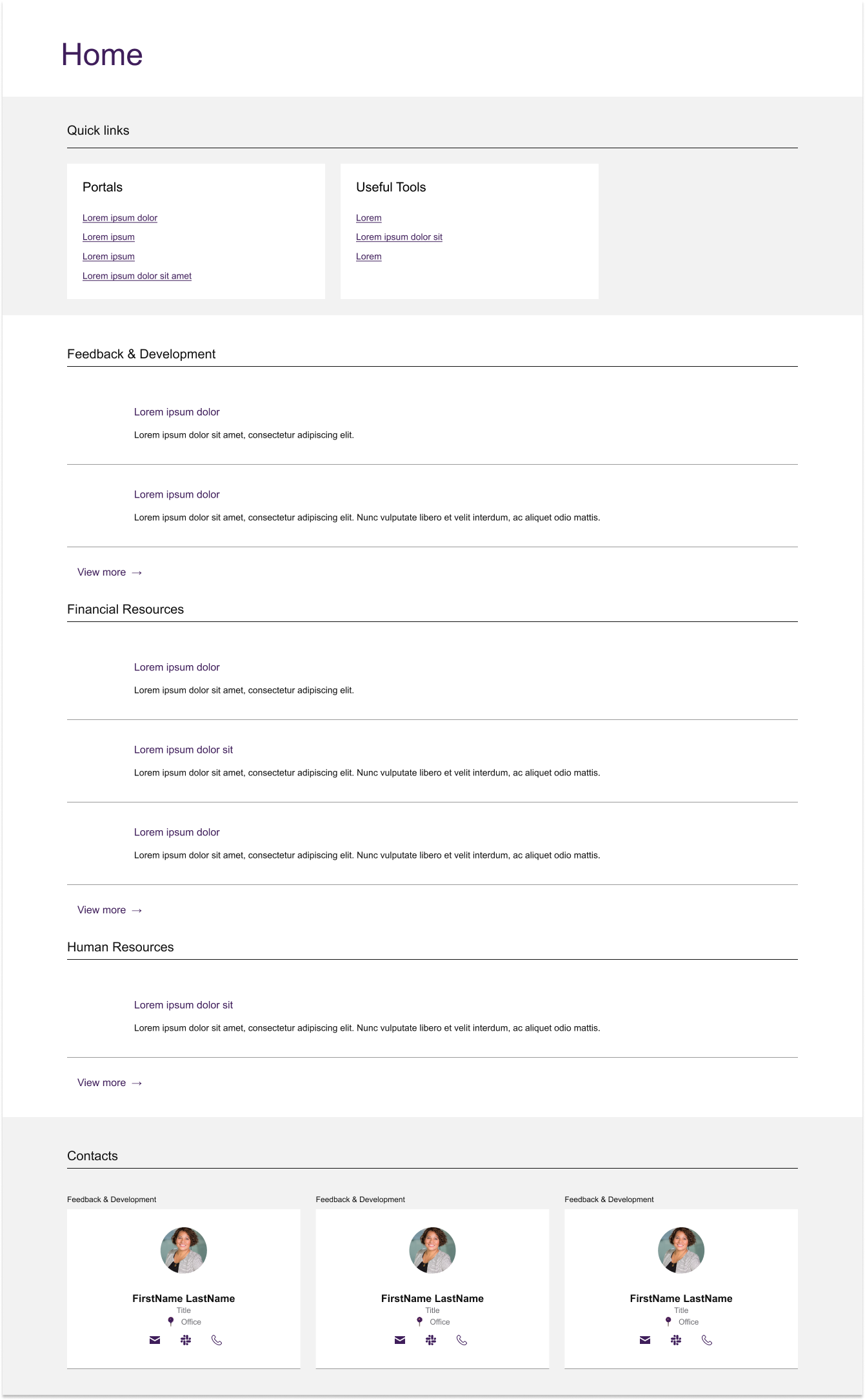
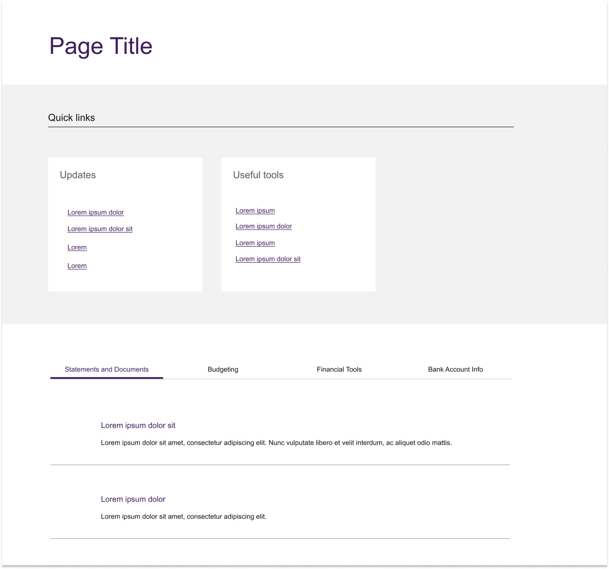
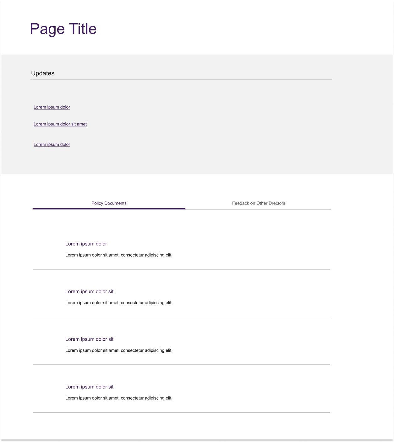
Continuing on the ideation for the site layout, I worked on preliminary Lo-Fi wireframes that reflected the new information architecture I worked on earlier. I iterated on the different ways of arranging content on the parent pages.

Design Framework
One of the limitations of the existing design was that all the links looked exactly the same irrespective of the type of link. For example, a link to a document would look the same as a link to a page or a tool. This was unintuitive because the user didn’t have any visual cues available to differentiate or categorize information when they saw it. Another limitation of the existing design was that it didn’t capture the dynamicity of the links based on importance in specific parts of the year. For example, some financial documents would need to be promoted more in certain parts of the year than other documents. The links in the existing design seemed to all be prioritized equally which needed to be changed to match the needs of the directors using the portal.
So, I set up a design framework to categorize the types of links into internal versus external to the portal with further subcategories. The types of links further could be further be categorized as featured, regular, or de-emphasized based on importance and priority.
Special Features
Search + Navigation: Introducing Megamenu to allow the user to get a glimpse of the page structure/ information architecture by hovering over the Navigation menu. Unlike previous navigation, this exists on every page of the site to allow the user to easily navigate inside the portal.
Director Selector (Admin Feature): Filtering directors based on country, nominal level and lifecycle flag filters. On the left, the image shows dropdown that opens when the admin user clicks on the director profile. Clicking “Advanced Filters,” opens the “Director Selector” pop-up.
Communications Widget: Consists of Action items and announcements that directors need to be notified about within the portal. Each action item corresponds to a tag reflecting the urgency and type of action item- differentiated by colors and icons. Ex: Red means top priority/ warning- user needs to interact with this action item right away.
Hi-Fi Wireframes
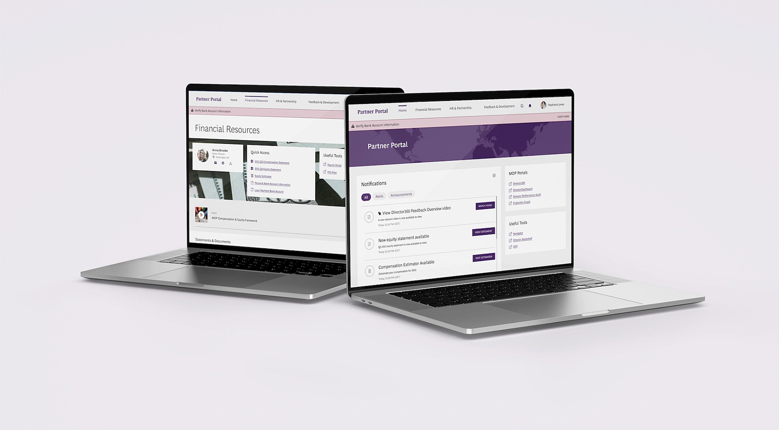
Based on the design framework and components identified, I built the Hi-Fi wireframes for the Portal. The new design consists of the home page, three main parent pages, and child pages:
Home Page
Parent Pages (Sidebar version & Banner version):
Financial Resources
HR & Partnership
Feedback & Development
Child pages
Parent pages- Version 1: Sidebar
For the first iteration, I incorporated a sidebar for each of the pages to ensure that users had access to contact information the quick access ( the most important links on the page), and the useful tools section at any point of the page. This felt like a good option and felt like it worked, but as I worked on the designs more, I realized that this design wasn’t scalable. As the length of the page increased, so did the length of the sidebar. This meant, that there was a ton of empty space at the bottom of the page for the majority of the pages.
The only case it worked well was for the “Feedback and Development” page because it had lesser content than other pages. At this point, the sidebar was no longer serving the purpose it was designed for in the first place- users would not have access to key information at any point of the page.
The consensus was that the sidebar was wasting space that the primary content could’ve utilized instead and wasn’t adding any value.
Parent Pages- Version 2: Banner (Preferred)
The decision was to get rid of the sidebar and use a banner instead. Just like the sidebar, the banner would exist on all the pages and also consist of contact information, quick access, and useful tools. But, it would exist on the top of the page under the title. This is because it gives the user a glimpse of all the important elements of the page before they scroll further. We also want the most important information to be the first thing users look at when they visit a page. While this design was unanimously preferred, there are still plans to A/B test the sidebar version and the banner with our users (managing directors and senior partners) to hear their thoughts and preferences about either design.
Child pages
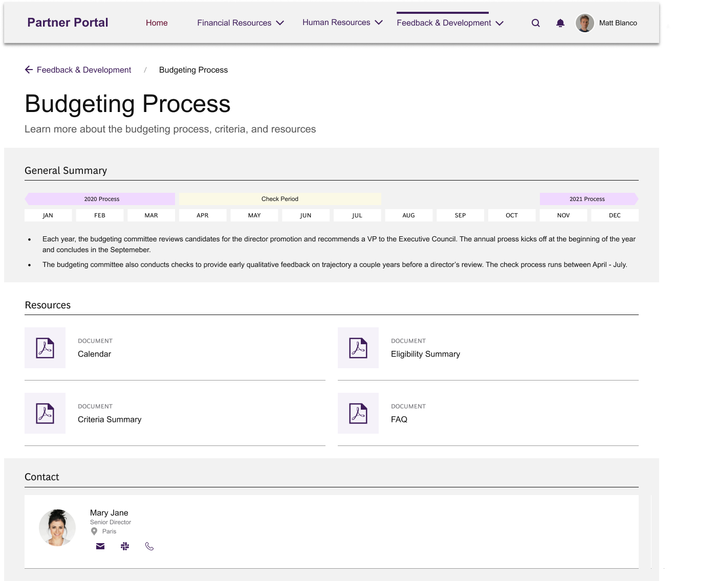
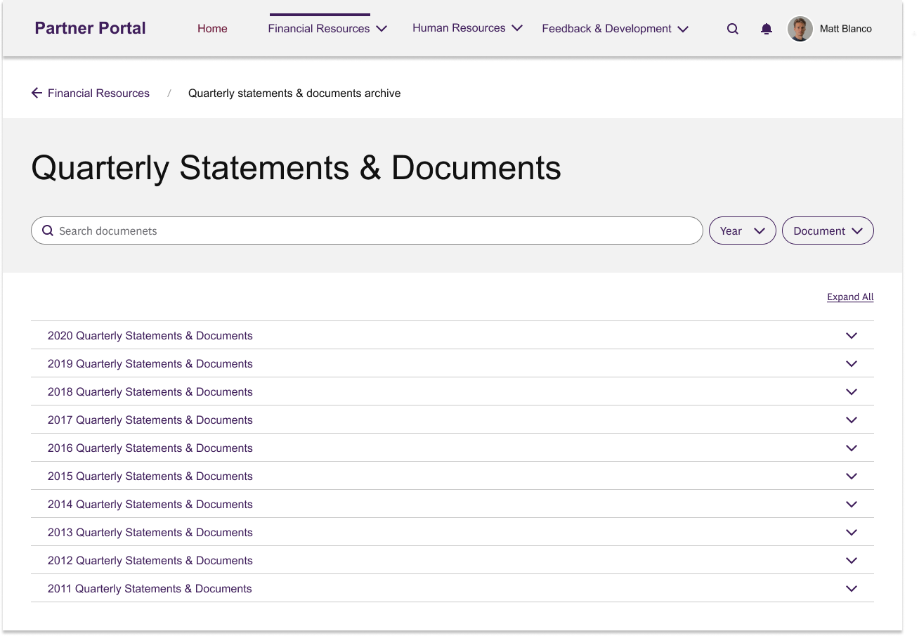
The Financial Resources, HR & Partnership, and Feedback and Development pages consist of child pages- including the Health Checker, Sumer Retreat, SOCS Process, Investment platform, and Compensation documents archive. The child pages follow a similar layout consisting of breadcrumbs on top, a banner, some content, and contact information on the bottom of the page.
Breadcrumbs are a new feature that was added to allow users to know their location on the portal with relation to other pages.
Banners (in gray) include the most important information on the website. For example: Program details

