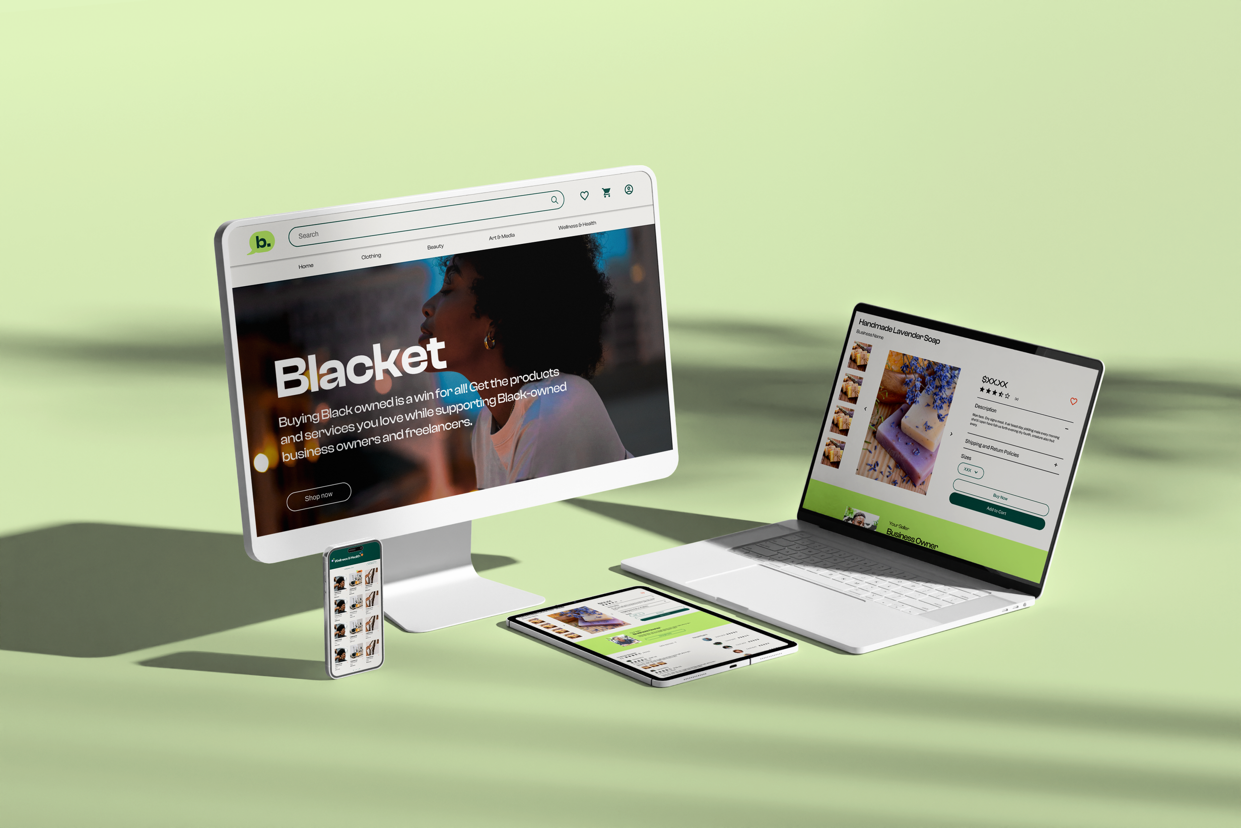
Blacket
PROJECT TYPE
UI/ UX Design + Branding + Brand Identity
YEAR
2021
Problem statement: The challenge was to design a social e-commerce platform for black-owned businesses, Blacket, that seamlessly combines the features of social media and e-commerce, allowing users to discover and share products while making purchases within the app.
Process: As the design lead, I collaborated with a team of designers to bring the vision of Blacket to life. Our primary objective was to create a clean and intuitive user interface that prioritized product discovery, easy navigation and highlighted black-owned businesses.
To achieve this, we focused on developing a user-friendly interface that allowed users to effortlessly explore and find products of interest. We also emphasized the importance of showcasing black-owned businesses on the platform, contributing to the promotion and support of these enterprises.
Additionally, we implemented a robust social media-esque system within Blacket. This feature enabled users to engage with vendors, interact with other users, and share their favorite products and collections with friends and followers. The social aspect aimed to enhance the overall user experience and foster a sense of community within the platform.
Solution: The work we accomplished on Blacket resulted in a compelling solution for the modern social shopper. By combining the functionalities of social media and e-commerce, we created a platform that seamlessly integrates product discovery, sharing, and purchasing. The clean and intuitive user interface, along with the emphasis on supporting black-owned businesses, provided users with an engaging and inclusive experience.
Research
Brand Research
My team and I started this project by conducting an exploratory interview as part of our efforts to understand Blacket more deeply and develop a strong brand identity. My team conducted several brand exercises. One of these exercises involved identifying personality levers for the brand - that is, key characteristics that would define Blacket's personality and help differentiate it from competitors. We explored a range of potential levers, such as "celebratory," "unconventional," and "informative," and ultimately settled on a set of four that felt most authentic to Blacket's vision and values.
Another important exercise we conducted was developing an elevator pitch for the brand. This involved distilling Blacket's key value proposition - the unique benefit it provides to users - into a short and compelling statement that could be used in a variety of contexts. We worked collaboratively to refine the pitch and ensure it effectively communicated the essence of Blacket to potential users and investors. These brand exercises were critical in helping us better understand Blacket's identity and develop a strong and cohesive brand strategy that could guide our design and development efforts.
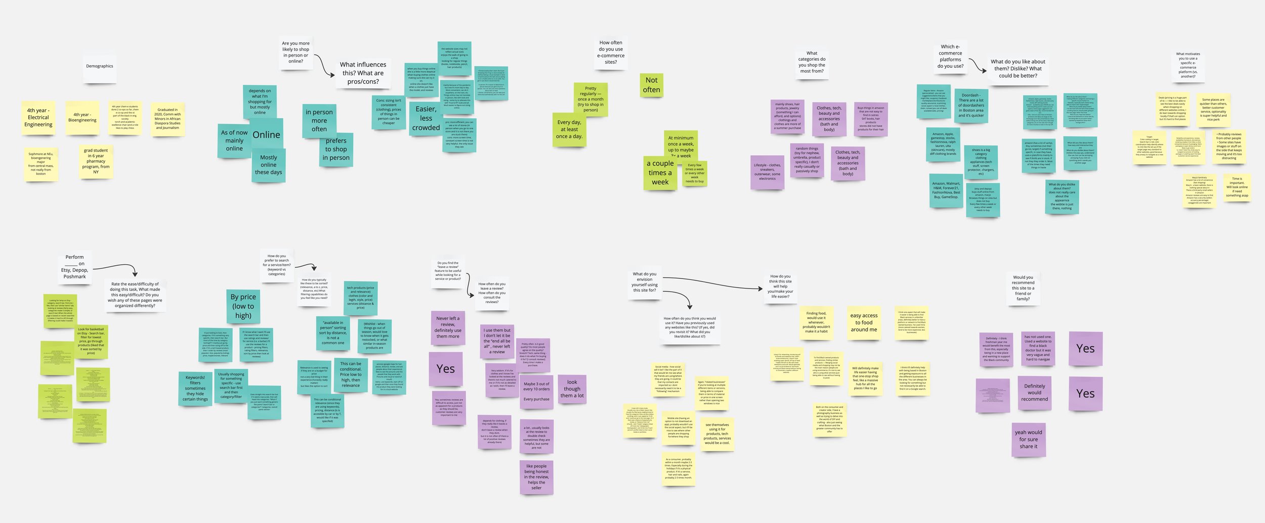
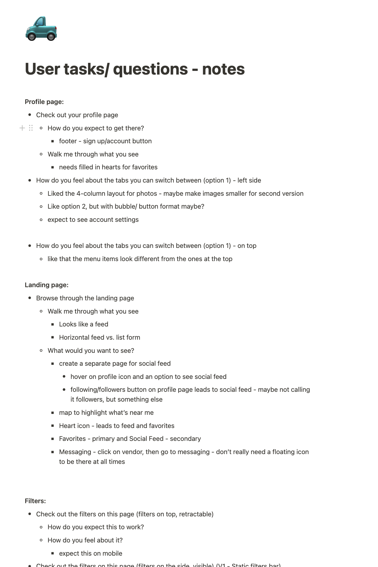
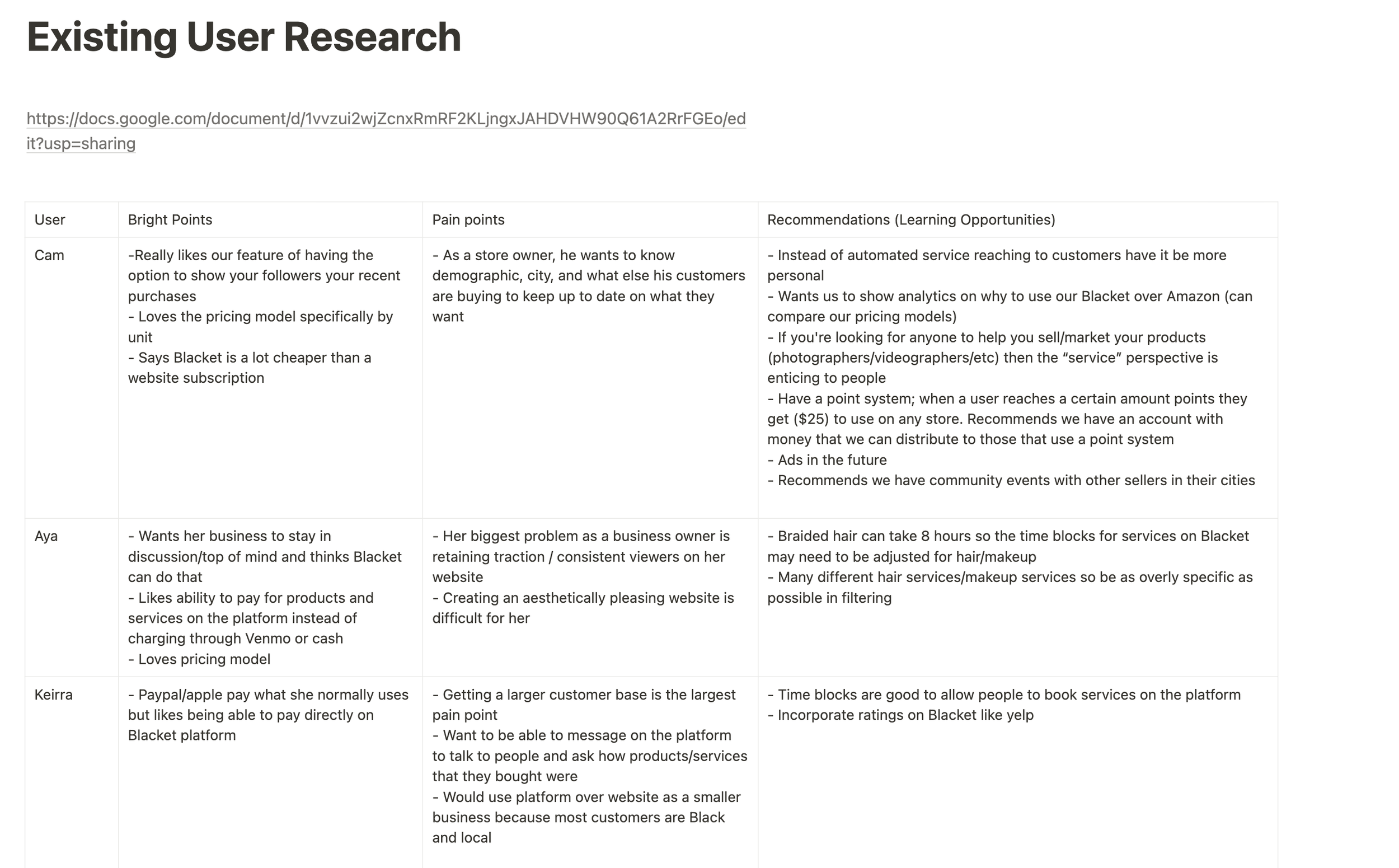
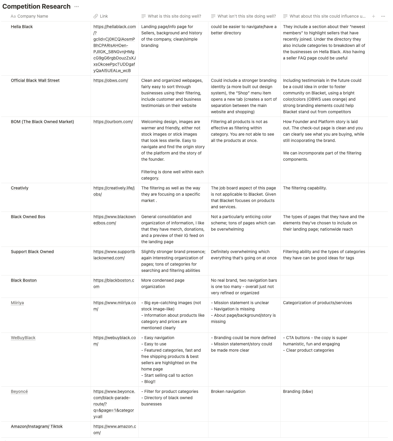
To ensure that the design of the Blacket platform was informed by user needs and preferences, my team conducted comprehensive user research. This research involved conducting competitive analysis and leveraging existing research to identify user pain points and key requirements within the social e-commerce landscape. Additionally, we conducted usability testing and user interviews, where participants were tasked with completing user flows on existing social e-commerce platforms while also answering a structured questionnaire. Through this qualitative research, we were able to gain a deep understanding of user behaviors and preferences, identifying key opportunities to improve the user experience of the Blacket platform. This research was instrumental in guiding our design decisions, ensuring that the Blacket platform is optimized for usability, engagement, and retention, and effectively meets the evolving needs of our users.
User research


User stories and features
Based on our research, we spent significant time writing user stories and defining corresponding features. We began by creating detailed user personas based on the target market provided by the client and considered possible pain points and opportunities for improvement. This was then translated into user needs into actionable tasks and user stories. For each user story, we defined the corresponding feature or function that would meet the user's need and achieve the desired outcome. We prioritized features based on their potential impact on the user experience and the overall product vision. By taking a user-centered approach to feature development and ensuring that each feature addressed a specific user need, we were able to create a product that meets the needs and expectations of our target audience.
Information Architecture
Lo-Fi Wireframes
Set up
We started off with setting up the main pages and getting a sense of the basic structure of the website. We iterated on some of the pages more than others and considered different versions before finalizing one.
Version 1
Version 2
Version 3
Version 4- selected version
One of the components we really iterated on was the nav bar where we tried to figure out how much information is ideal and how it should be represented. Our decision-making was guided by delving deeper into thinking about consumer shopping behavior and how information hierarchy needs to be accordingly.
In the end, we decided on version 4 which consists of 2 levels- the main navigation bar consisting of the search bar and primary functions including shopping art and profile. The second level consists of tabs showing different types of products. We went ahead with this version because according to our consumer interviews- people are more likely to search than browse on Blacket. Consumer shopping behavior is a little different on a platform like Blacket compared to e-commerce websites like Amazon where browsing behavior may be more common- on Blacket- consumers use a more targeted search approach in hopes of finding a specifc product or service.
Profile
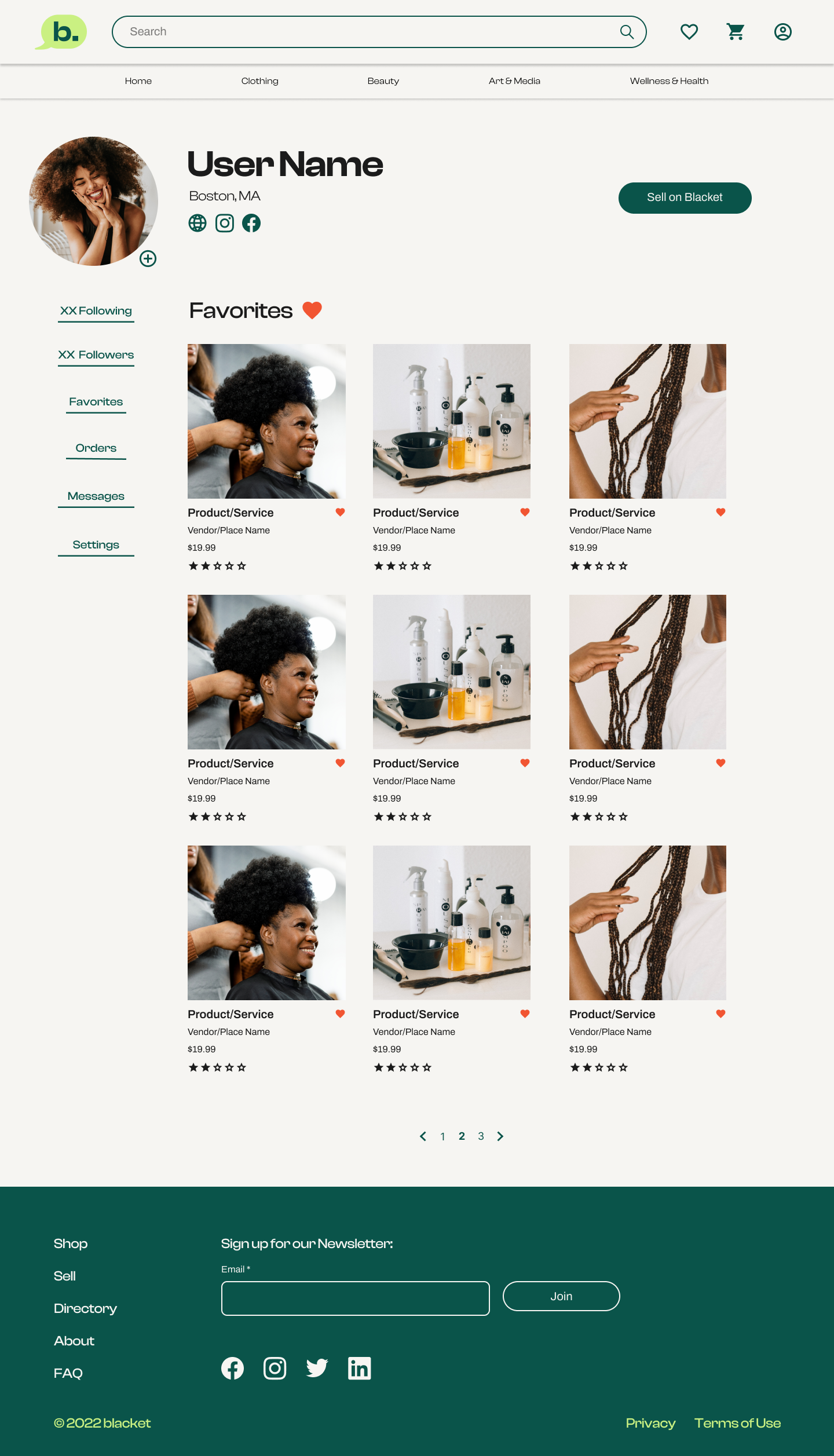
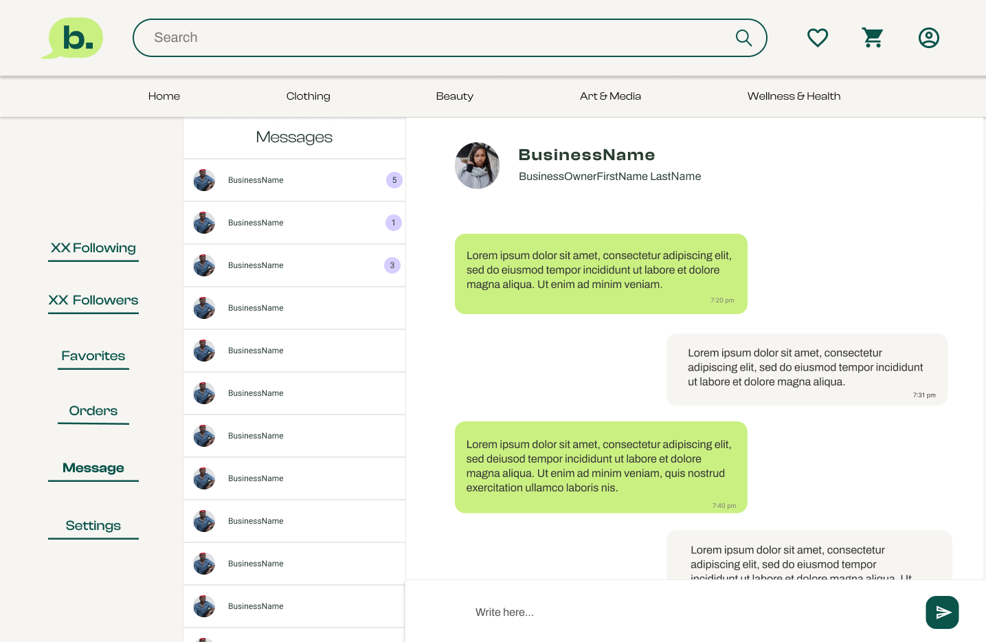
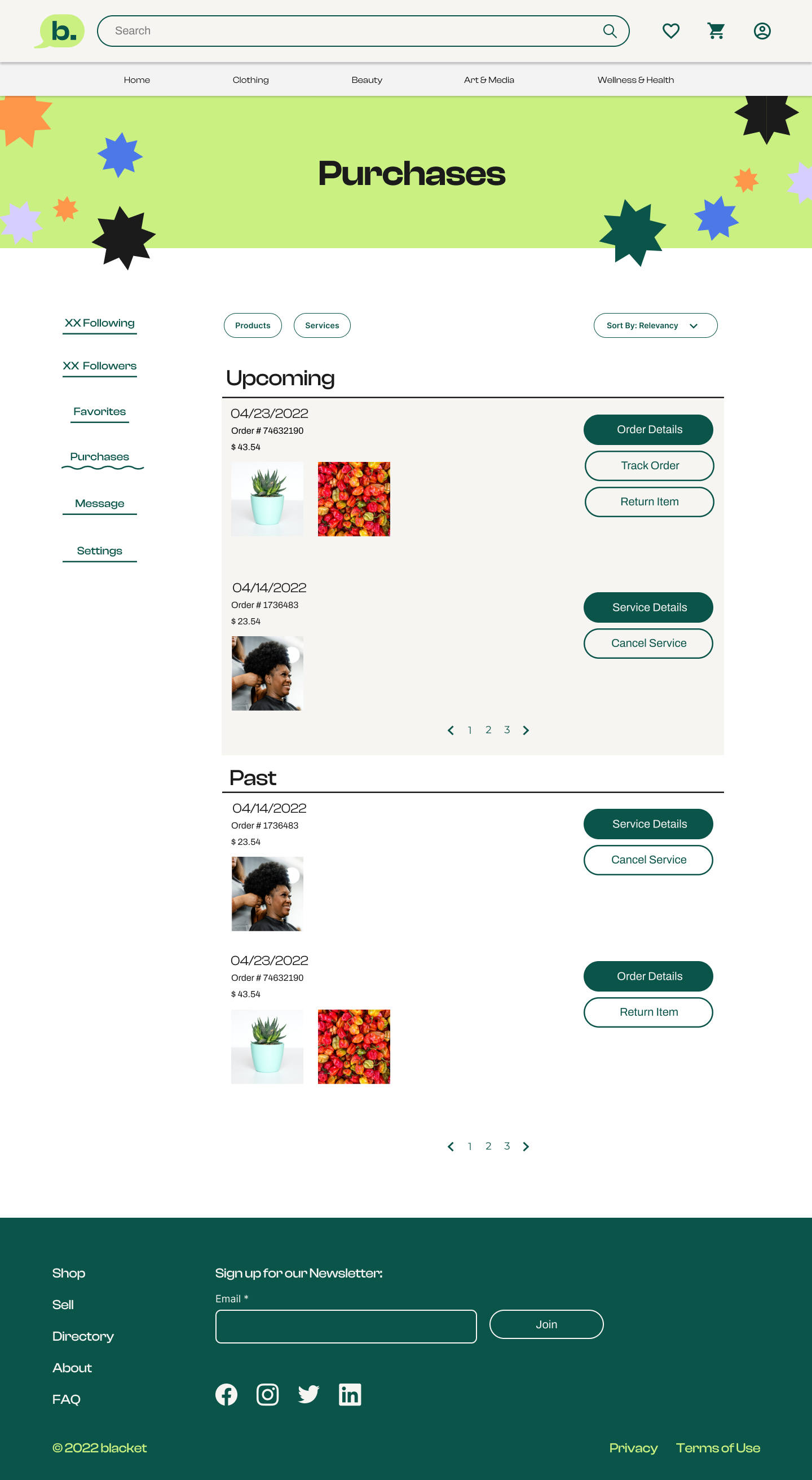
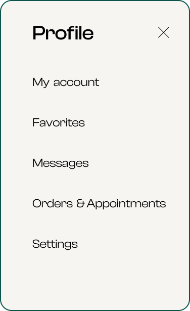
The personal profile page on the website consisted of a user’s favorite product/ service, number of followers, number of people following them, orders, messages, and settings. We looked into two different versions where we had these functionalities appear in the form of a sidebar on this page (version 1) and in the form of tabs (version 2.)
We ended up going with version 1 since it provided a clearer sense of information hierarchy compared to version 2. Version two added another level of menu below the menu and submenu which seemed to make the navigation more complex.
version 1- selected version
version 2
Filters
version 2- selected version
version 1
We designed two versions of filters on the results pages- with and without a sidebar. Version 1 encapsulates all filters within the ‘All Filters’ filter chip while version 2 consists of a sidebar consisting of the most vital filters.
We considered both options since one option provided a clean design while the other version provided all functionality on the main page.
We finalized on version 2 since it allowed easy access to filters and version 1 abstracted the functionality.
Product & Service page
Product page without business owner information
2. Product page with business owner information (de-emphasized and on the side)
3. Product page with business owner information (emphasized and centered) - selected version
The team designed 3 different versions of the product and service pages.
Product page without business owner information
Product page with business owner information (de-emphasized and on the side)
Product page with business owner information (emphasized and centered)
We ended up going with the third version since it resonated most with Blacket’s value proposition- giving black-owned businesses a voice and platform. Having the business owner information needed to be emphasized so users have easy access to them including the ability to reach out to them and learn more about their business.
Design Strategy
The team iterated on possible design strategies after our first client meeting. Each strategy encapsulated each designer’s understanding of the company’s personality and audience for the platform.
We finalized on the third strategy!
Design system
Branding
UI elements & Components



Hi-Fi Wireframes
Home page
Home page pre-login or sign up
3. Home page post log-in
2. Home page post-sign-up
Users viewed a different home page based on their interaction with Blacket.
Home page pre-login or sign up
Home page post-sign-up (populated data based on community favorites and purchases)
Home page post log-in (populated data based on user’s search history)
Product & Service page
The product and service pages provided a description of the product/service, information on the business owner with a CTA to message them, reviews, related products, and a list of buyers who have also purchased the same product (and enabled this privacy feature at their end.) The list of buyers provides a social element to this page where users get a sense of purchases made in their community.
Search
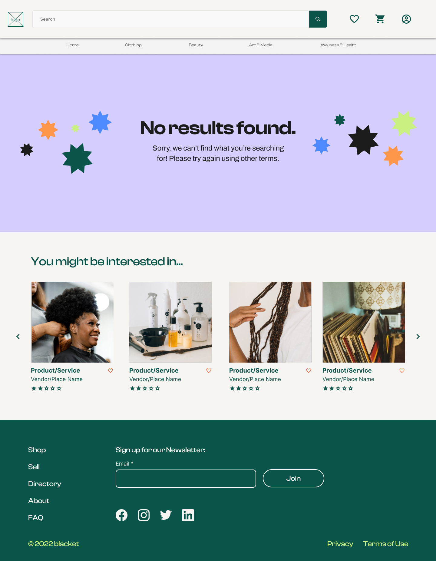
The mockups on the left reflect the four different types of search results
Search by keyword
Search by category
Search by business
No search results
Search by keyword
2. Search by category
3. Search by business
4. No results found
Others pages!
